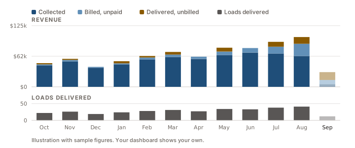
Your dashboard now shows revenue — collected, billed and still unbilled — not just load counts.
Business health used to show two numbers: loads delivered, and loads invoiced. Useful — but neither of them is money. It now shows the cash behind the work, and how much of it you have actually been paid.
Each bar is a month's revenue, split by where the cash actually is, over the loads you delivered that month. When the dark blue stops growing and the amber above it swells, the business is outrunning its cash — and you can see it a month early.
What's new
Revenue, billed and collected — per month. Every figure follows the loads you delivered that month, so you can see what a month's work actually turned into rather than what happened to land in the mail that week.
It's a report too. Reports carries the same view for any range — this month, this quarter, this year, the last 90 days, or dates you pick — with totals for the range.
Needs attention shows everything. Expiring credentials, overdue maintenance and open claims are grouped Overdue, Due soon and No deadline, most urgent first, and the list scrolls instead of stopping.
Load detail loads complete. Assignment times and driver pay are there the moment the page opens, instead of filling in a few seconds later.
Sorting you can see. On the loads list the column you are sorted by is now obvious at a glance, with the direction marked.
And it looks like us now
DispatchInAI has the same navy-and-amber treatment as our website: one typeface throughout, a lighter page, cleaner cards and clearer labels. We also went through the whole app and fixed close to three hundred places where small text was too faint to read comfortably — which matters most on a phone, in a cab, in daylight.
The dashboard, the loads list, invoicing and reports were all rebuilt to work properly at phone width too, so the charts and headers stay readable on a small screen.
Nothing to update and nothing to learn. It is already live in your account — same login, same data.